Revitalizing


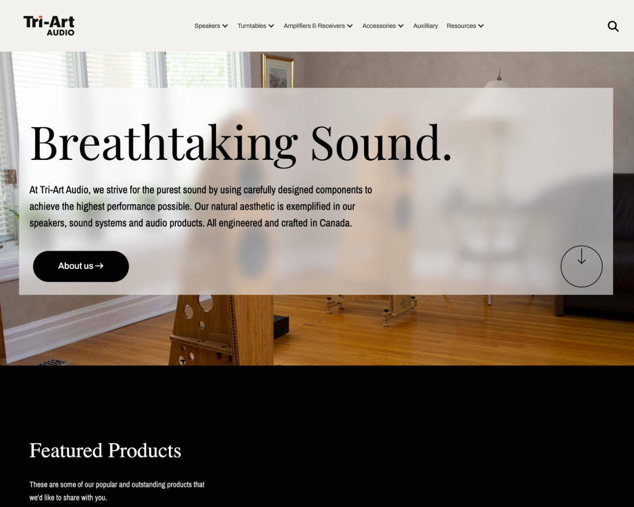
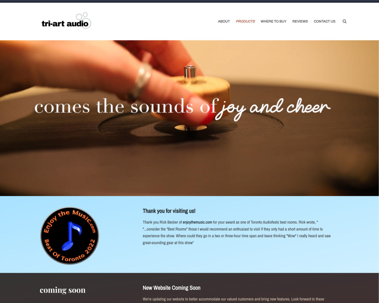
The original Tri-Art audio website was designed with the brand’s old design cues which drew criticism for underplaying the quality of our products. With the new website, I wanted to bring the design in line with the more sophisticated designs of our recent products. Gone were the browns and yellows that reminded the customers of 70s station wagons, replaced with a more subdued palette and a focus on product imagery. I also focused on making the navigation and product categorization more intuitive, allowing customers to find what they were looking for without having to poke around until it appeared.


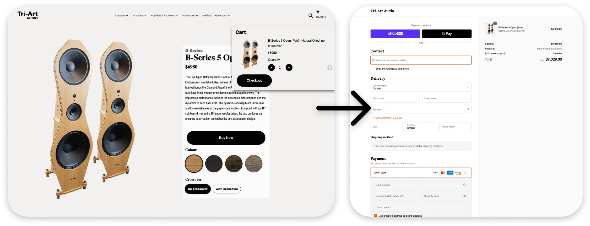
Since Tri-Art was pushing to sell all their products online, ecommerce was a necessity. I used Webflow to create the frontend shopping experience, and Shopify to handle the checkout. This made sense for the company as the other online stores already used Shopify, but we needed some features it just couldn’t provide to properly showcase the audio equipment. I programmed a bridge that connected the two and made it possible to have a seamless shopping experience for the customer, while giving the sales department all the tools they needed to fulfill orders.
One difficulty I had with the old site was its unwieldiness and legacy code. Making an edit as simple as adding a video banner meant going into html files. With the new setup, I made sure that all sorts of marketing and product details could be changed with the push of a button, allowing designers and marketers who didn’t have coding expertise to make changes and add products.